Klimator
Scandinavian minimalism for a listed deep-tech company
A cinematic, restrained corporate site that has to serve winter maintenance operators, automotive OEMs and public market investors at the same time.
- Industry
- Automotive & Mobility
- Platform
- Modern JS
- Reviewed
- 2026
- Region
- Sweden
- Study type
- Independent teardown
- Surfaces reviewed
- Home, product, technology, contact
- Viewports captured
- 1440 · 834 · 390
- Stack confirmed via
- Markup, assets, headers
- Comparable build
- 9–12 weeks
- Team shape
- Design + modern JS + content
Independent design and engineering study of a publicly available website. Observations are drawn from the live site, its markup and its response headers. Muonix Technolabs is not affiliated with, and does not claim authorship of, the work reviewed here.
The brief
Klimator turns road weather science into products for winter road maintenance and automotive safety — two audiences that share a data source but almost nothing else in their buying behaviour.
The site handles that with Scandinavian discipline: cool palette, enormous whitespace, calm typography and a structure that separates public-sector maintenance from automotive OEM interest without duplicating the science underneath.
The atmosphere is doing real work. Road weather is an anxiety category — ice, risk, liability — and a calm, precise interface communicates control far better than dramatic imagery would.
We reviewed the public site across three viewports and traced its delivery stack, content structure and how technical credibility is expressed through restraint.
Project overview
Klimator turns road weather data into operational decisions for winter maintenance and autonomous driving — and, as a Nasdaq First North listed company, must also serve investors.
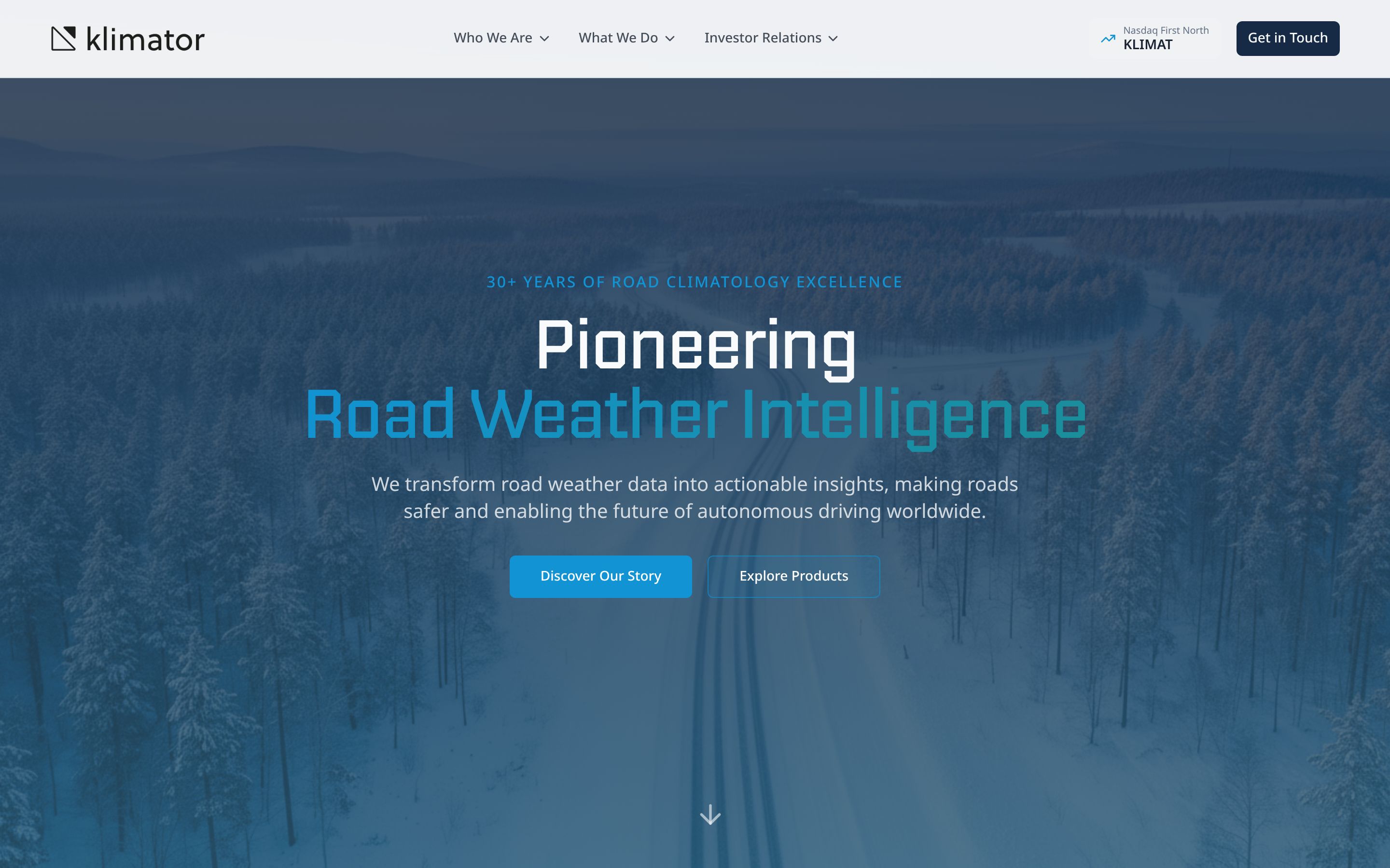
The site answers that with an aerial winter hero, an ice-blue palette and a calm, evenly spaced layout that never raises its voice.
About the client
Klimator is a Swedish software company founded in 2001, with 30+ years of road climatology research behind it.
The site states 15+ team members, presence in more than ten countries, and lists products including a road condition data platform, the Saltera winter maintenance SaaS and automotive solutions.
- Industry
- Automotive & Mobility
- Profile
- Listed road weather intelligence company
- Country
- Sweden
Website goals
- Serve three audiences — municipal operators, automotive OEMs and investors — from one corporate site.
- Establish scientific authority built on three decades of research.
- Route product interest to the separate Saltera product surface.
- Meet listed-company expectations for investor information.
Discovery findings
One science, two markets
Shared research underpins separate product narratives for road authorities and automotive partners, avoiding a diluted middle.
Calm in an anxious category
Cool tones and open space frame the company as the steady party in a risk conversation.
Credibility through specificity
Data sources, coverage and method are stated plainly, which is what technical and public-sector evaluators check first.
Edge-delivered and lean
A modern JavaScript front end behind a global CDN keeps the experience fast across Nordic and international traffic.
Design approach
- A full-bleed aerial photograph of a snow-covered forest road, colour-graded into the brand's blue.
- A two-tone headline — white above, brand blue below — that separates the claim from the category.
- Wide letter-spaced eyebrow text used as a quiet credibility line.
- Generous vertical rhythm throughout, with statistics presented as bare numerals and labels.
Design decisions
Whitespace as precision
Generous negative space reads as scientific confidence — the page is not trying to fill silence with claims.
Cool palette, warm contrast
A cold base with carefully placed warm accents keeps the winter theme without becoming clinical.
Data as imagery
Maps and forecasts replace stock photography, which is both more honest and more persuasive.
Quiet motion
Transitions are short and subtle, supporting the sense of a controlled system rather than a marketing site.
UI/UX highlights
Investor signal in the header
The Nasdaq First North ticker sits beside the primary CTA — an unusual and deliberate trust cue.
Paired hero actions
"Discover Our Story" for narrative and "Explore Products" for commercial intent.
Scroll affordance
A single arrow indicator invites continuation past a full-viewport hero.
Product cards with feature lists
Each solution states four concrete capabilities rather than marketing adjectives.
Information architecture
- Who We Are
- Company history and narrative, including a dedicated /history page.
- What We Do
- Products and solutions grouped under one menu.
- Investor Relations
- A first-class navigation group, as listing obligations require.
- External product
- Saltera linked out to its own domain rather than absorbed into the corporate site.
CMS strategy
Product and solution cards share a single structure — eyebrow, title, description, feature list — which points to a templated content model.
Investor content is separated from marketing content in the navigation, so regulatory updates can be published on a different cadence.
The site is served dynamically with no-cache headers, consistent with frequently updated corporate and investor content.
Design showcase
Development highlights
Component-driven front end
A modern JS build gives fine-grained control over rendering and interaction that a visual builder could not deliver for data views.
Edge delivery
CDN hosting keeps latency low across markets, which matters for a vendor selling real-time data quality.
Static-first rendering
Content pages ship as pre-rendered HTML so the marketing surface stays fast regardless of data-view complexity.
Accessible interactive views
Map and data components need keyboard paths and text equivalents to clear AA — designed in, not bolted on.
Key features
Cinematic hero
A full-viewport aerial image establishing climate and geography in one frame.
Heritage counters
Founded year, team size, countries and years of research as a single credibility band.
Product portfolio cards
Three solution families, each with a concrete capability list.
Investor navigation group
Listed-company information given equal weight to product.
Technical highlights
- Server-rendered application delivered through Cloudflare with a deployment-id header.
- Security headers including HSTS, nosniff and a strict referrer policy.
- No-cache directives suited to frequently updated investor content.
- Product surface separated onto its own domain at saltera.io.
Performance & accessibility
- Server-rendered HTML behind Cloudflare, with strict transport security and content-type protection headers set.
- A referrer policy of strict-origin-when-cross-origin is applied at the edge.
- The hero photograph is darkened behind the headline, holding contrast for white type over imagery.
- Text-first hero content means the primary message is readable before the background image resolves.
Responsive experience
- The four-statistic band collapses to two columns, keeping numerals dominant.
- Hero actions stack full width on mobile with comfortable touch targets.
- The ticker badge moves into the mobile menu rather than crowding the header.
Challenges solved
Three audiences with different obligations
Solved with top-level navigation groups per audience rather than a blended corporate story.
Deep science, short attention
Solved by compressing thirty years of research into a four-number band.
Product versus corporate identity
Solved by giving Saltera its own domain and linking rather than nesting.
Technologies used
- Server-rendered JS
- Cloudflare
- Design system tokens
- Edge security headers
Identified from public markup, asset origins and response headers only.
How Muonix would build this
A delivery plan for a site at this standard, scoped the way we actually run engagements — three senior founders, no handoffs, fixed phases.
- 01
Dual-market positioning
Week 1–2Separate the public-sector and automotive narratives while keeping one shared evidence base for the science.
- Market narratives
- Shared proof library
- Sitemap
- Terminology guide
- 02
Nordic design system
Week 3–5Build a restrained system where whitespace, scale and data visualisation carry the impression of precision.
- Spacing and type scale
- Data visualisation rules
- Component library
- Motion guidelines
- 03
Modern JS build
Week 6–10Implement a component-driven front end with static delivery, structured content and accessible interactive maps or data views.
- Component implementation
- Content integration
- Accessible data views
- Edge deployment config
- 04
Performance, i18n and launch
Week 11–12Tune Core Web Vitals, prepare multi-market content handling, then launch behind a CDN with monitoring.
- Performance budget
- Language and market handling
- Accessibility AA pass
- Monitoring
Observable impact
- Perceived control
- Calm design positions the company as the reliable party in a risk-heavy category.
- Dual-market clarity
- Two buyer narratives coexist without duplicating the underlying science.
- Global performance
- Edge delivery keeps the experience consistent outside the Nordics.
- Evidence-forward
- Method and coverage are stated where evaluators look for them.
Verdict & takeaways
“Scandinavian restraint used strategically — the calm is the positioning, not just the aesthetic.”
- 01In anxiety categories, calm design outperforms dramatic design.
- 02Whitespace is the cheapest credibility signal available to a technical brand.
- 03If your product is data, make the data the imagery.
Related services
Want this standard of build for your product?
Three senior founders, no outsourcing, one accountable team across Webflow, Shopify, WordPress and modern JavaScript. Tell us what the site has to do and we'll scope it honestly.