Techture
A services catalogue built for enquiry capture
A broad BIM and VDC services site where navigation depth, proof counters and persistent contact affordances are all pointed at one thing: a qualified call.
- Industry
- Manufacturing & Construction
- Platform
- Webflow
- Reviewed
- 2026
- Region
- India / Global
- Study type
- Independent teardown
- Surfaces reviewed
- Home, services, projects, insights
- Viewports captured
- 1440 · 834 · 390
- Stack confirmed via
- Markup, assets, headers
- Comparable build
- 8–10 weeks
- Team shape
- Design + Webflow + SEO
Independent design and engineering study of a publicly available website. Observations are drawn from the live site, its markup and its response headers. Muonix Technolabs is not affiliated with, and does not claim authorship of, the work reviewed here.
The brief
Techture sells BIM and digital engineering into construction — an industry that buys on delivered projects, not on adjectives. The site is built accordingly: work first, capability second, company last.
The design language borrows from the discipline itself. Structured grids, technical typography, drawing-like line work and dense but ordered information blocks make the site feel like it was produced by people who read construction documents for a living.
It also has to work globally. The same pages address Indian and international procurement, so credibility markers — project scale, sectors, standards — are carried visually rather than in region-specific copy.
We reviewed the public site across three viewports and mapped how project evidence, service depth and thought leadership reinforce one another.
Project overview
Techture sells BIM and virtual design services across the architecture, engineering and construction sector — a long, technical catalogue aimed at procurement-led buyers.
The site handles that breadth with a six-group mega navigation, a metrics band directly under the hero, and gated resource downloads wired to a consent-aware form.
About the client
Techture is a global, multidisciplinary BIM service provider serving the AEC industry across design, construction and facility management phases.
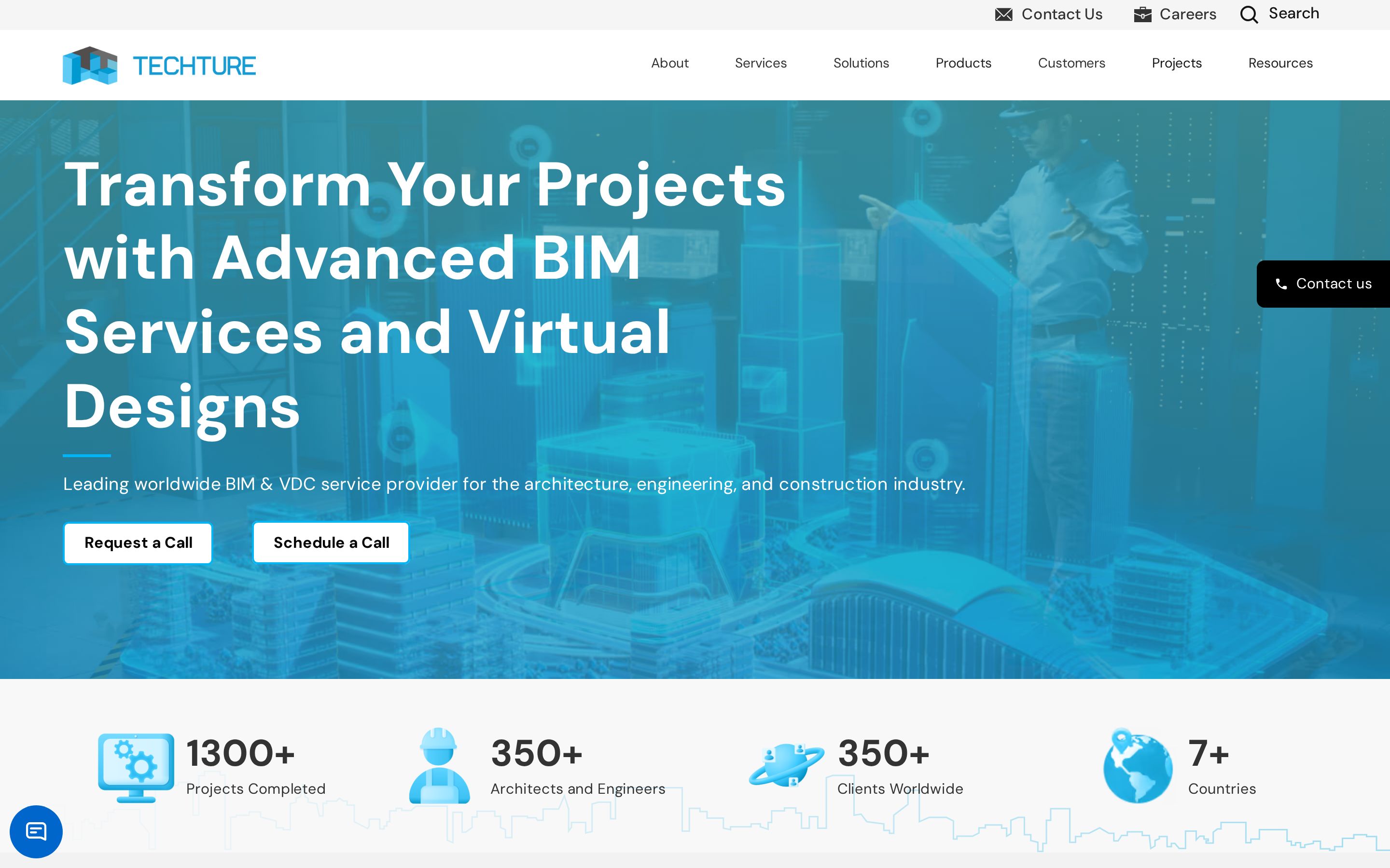
The homepage states 1300+ projects completed, 350+ architects and engineers, 350+ clients worldwide and presence in 7+ countries.
- Industry
- Manufacturing & Construction
- Profile
- BIM and VDC services for the AEC industry
- Country
- India / Global
Website goals
- Present a wide services catalogue without forcing visitors through a single generic overview page.
- Establish scale and delivery credibility immediately for enterprise construction buyers.
- Capture enquiries and resource downloads with explicit consent handling.
- Serve an international audience arriving from search on specific BIM disciplines.
Discovery findings
Projects are the product
Delivered work is placed where most agencies put a value proposition, matching how construction buyers actually shortlist.
Sector segmentation
Capability is expressed per sector, which lets a specific buyer recognise themselves without a bespoke page.
Technical register
Grid discipline and mono-inflected type signal engineering competence to an audience fluent in drawings.
Insight as reach
A publishing programme extends the site beyond procurement into an ongoing search and authority surface.
Design approach
- A full-bleed technical hero image with a bordered headline block — an architectural framing device rather than a decorative one.
- Cyan-on-white palette derived from the wireframe aesthetic of BIM software itself.
- Icon-led statistics band that turns claims into scannable structure.
- Section-per-discipline layout, so each service reads as its own module.
Design decisions
Grid as argument
A visible, strict column grid communicates precision to buyers who spend their day inside coordinate systems.
Restrained colour on dense pages
With this much information per screen, colour is reserved for state and emphasis, never decoration.
Line work over illustration
Technical line detailing references drawings without resorting to literal blueprint clichés.
Photography as scale proof
Site and model imagery is used to convey project magnitude, which copy alone cannot do credibly.
UI/UX highlights
Persistent contact rail
A fixed side tab plus a chat launcher keep enquiry one click away at any scroll depth.
Six-group navigation
About, Services, Solutions, Products, Customers, Projects and Resources split a deep catalogue into predictable buckets.
Consent-first forms
Contact forms state the consent terms inline and link the privacy policy before submission.
Success and error states
Download forms carry explicit thank-you and failure messaging rather than a silent redirect.
Information architecture
- Services
- Discipline-level pages beneath a services hub, matched to how buyers search.
- Proof
- Separate Projects and Customers sections rather than a single mixed portfolio.
- Products
- Productised tooling kept distinct from the services catalogue.
- Resources
- Gated downloads with a dedicated form and confirmation flow.
CMS strategy
Projects, resources and customer stories are collection-driven, which is what allows a catalogue of this size to stay consistent.
Case-study thumbnails, titles and downloads are fields on a record, so the marketing team publishes without design involvement.
Resource gating is a template-level behaviour rather than a per-page build.
Design showcase
Development highlights
Metadata-rich project records
Sector, service and scale live as structured fields, enabling filters, related work and schema output from one source.
Image discipline
Construction photography is the heaviest payload on a site like this; responsive sources and lazy loading are load-bearing engineering, not polish.
Cross-linking automation
Projects surface related services and insights automatically, which deepens sessions without manual curation.
Global-ready structure
Content avoids region-locked framing, so one page set serves several markets.
Key features
Metrics band
Four icon-led counters immediately after the hero, positioned as delivery credibility.
Gated resource downloads
A modal form with consent copy, thank-you state and error handling.
Sticky enquiry tab
An always-available contact affordance anchored to the viewport edge.
Discipline sections
Each BIM service presented as a self-contained block with its own entry point.
Technical highlights
- Webflow build with CMS collections for projects, resources and customers.
- Third-party file delivery for large downloadable assets alongside the Webflow CDN.
- Live chat widget integrated without blocking the initial render.
- Consent language and privacy linkage handled at the form template level.
Performance & accessibility
- Statistic icons and decorative marks ship as SVG; only the hero and project imagery are raster.
- Hero media is delivered in AVIF, keeping a large full-bleed image affordable.
- Icons carry descriptive alt text such as "Projects Completed icon", which helps screen-reader users parse the metrics band.
- White-background body copy with dark text keeps the long service descriptions readable.
Responsive experience
- The four-item statistics band reflows to a two-by-two grid before stacking.
- The fixed contact tab moves out of the reading column on narrow viewports so it never covers content.
- The bordered hero headline drops its frame on mobile, preserving line length over decoration.
Challenges solved
A catalogue too large for one page
Solved by grouping the navigation around buyer intent — services, solutions, products, proof.
Converting technical search traffic
Solved with discipline-level landing pages plus a permanently visible enquiry path.
Collecting details compliantly
Solved with inline consent copy and explicit form state messaging.
Technologies used
- Webflow
- Webflow CMS
- AVIF media
- Live chat integration
Identified from public markup, asset origins and response headers only.
How Muonix would build this
A delivery plan for a site at this standard, scoped the way we actually run engagements — three senior founders, no handoffs, fixed phases.
- 01
Evidence audit
Week 1–2Inventory delivered projects, sectors and standards, then decide which twelve pieces of evidence carry the whole site.
- Project inventory
- Sector matrix
- Proof hierarchy
- Sitemap
- 02
Technical design system
Week 3–5Design a strict grid with drawing-inspired detailing so density reads as competence rather than clutter.
- Grid and spacing system
- Type scale with mono accents
- Project card and detail templates
- Diagram and line-work rules
- 03
Build with project CMS
Week 6–9Model projects, sectors and insights as collections with rich metadata, so filtering and cross-linking are automatic.
- Project schema with sector tags
- Filterable index
- Insight templates
- Internal linking rules
- 04
SEO, performance and launch
Week 9–10Optimise heavy project imagery, add structured data for projects and articles, then launch with monitoring.
- Image pipeline and lazy loading
- Schema markup
- Core Web Vitals pass
- Search Console setup
Observable impact
- Shortlist readiness
- A procurement reader can reach relevant delivered work within two clicks from any entry point.
- Category authority
- Insight publishing keeps the domain relevant between procurement cycles.
- Density without fatigue
- Strict grid and spacing let information-heavy pages stay scannable.
- Scalable evidence
- New projects extend filters and related links automatically.
Verdict & takeaways
“Proof-led architecture done properly: the work is the argument, and the design just gets out of its way.”
- 01In delivery industries, lead with delivered work, not positioning language.
- 02Structured project metadata pays for itself in filtering, SEO and internal linking.
- 03Density is fine when the grid is strict enough to carry it.
Related services
Want this standard of build for your product?
Three senior founders, no outsourcing, one accountable team across Webflow, Shopify, WordPress and modern JavaScript. Tell us what the site has to do and we'll scope it honestly.