Tutero
Two audiences, one warm education platform
A bright, high-energy Webflow build that splits instantly between families looking for tutoring and schools evaluating an AI teaching platform.
- Industry
- Education
- Platform
- Webflow
- Reviewed
- 2026
- Region
- Australia / United States
- Study type
- Independent teardown
- Surfaces reviewed
- Home, parents, schools, resources
- Viewports captured
- 1440 · 834 · 390
- Stack confirmed via
- Markup, assets, headers
- Comparable build
- 9–12 weeks
- Team shape
- Design + Webflow + content ops
Independent design and engineering study of a publicly available website. Observations are drawn from the live site, its markup and its response headers. Muonix Technolabs is not affiliated with, and does not claim authorship of, the work reviewed here.
The brief
Tutero has to sell to two people who want opposite things from a website. A parent wants reassurance, warmth and a price they can understand. A school leader wants evidence, curriculum alignment and a procurement path. Most education sites pick one and lose the other.
The build solves it with routing rather than compromise: a warm, human homepage that immediately forks into audience-specific journeys, each with its own proof, tone and call to action. Nothing is watered down because nothing is shared that shouldn't be.
Visually it is the opposite of Aibidia — rounded geometry, soft colour, illustration and photography of real learning. That warmth is doing conversion work: it lowers the perceived risk of handing over a child's learning to software.
We reviewed the public site across three viewports, mapped its audience routing and content model, and traced how the design system keeps two tones coherent inside one brand.
Project overview
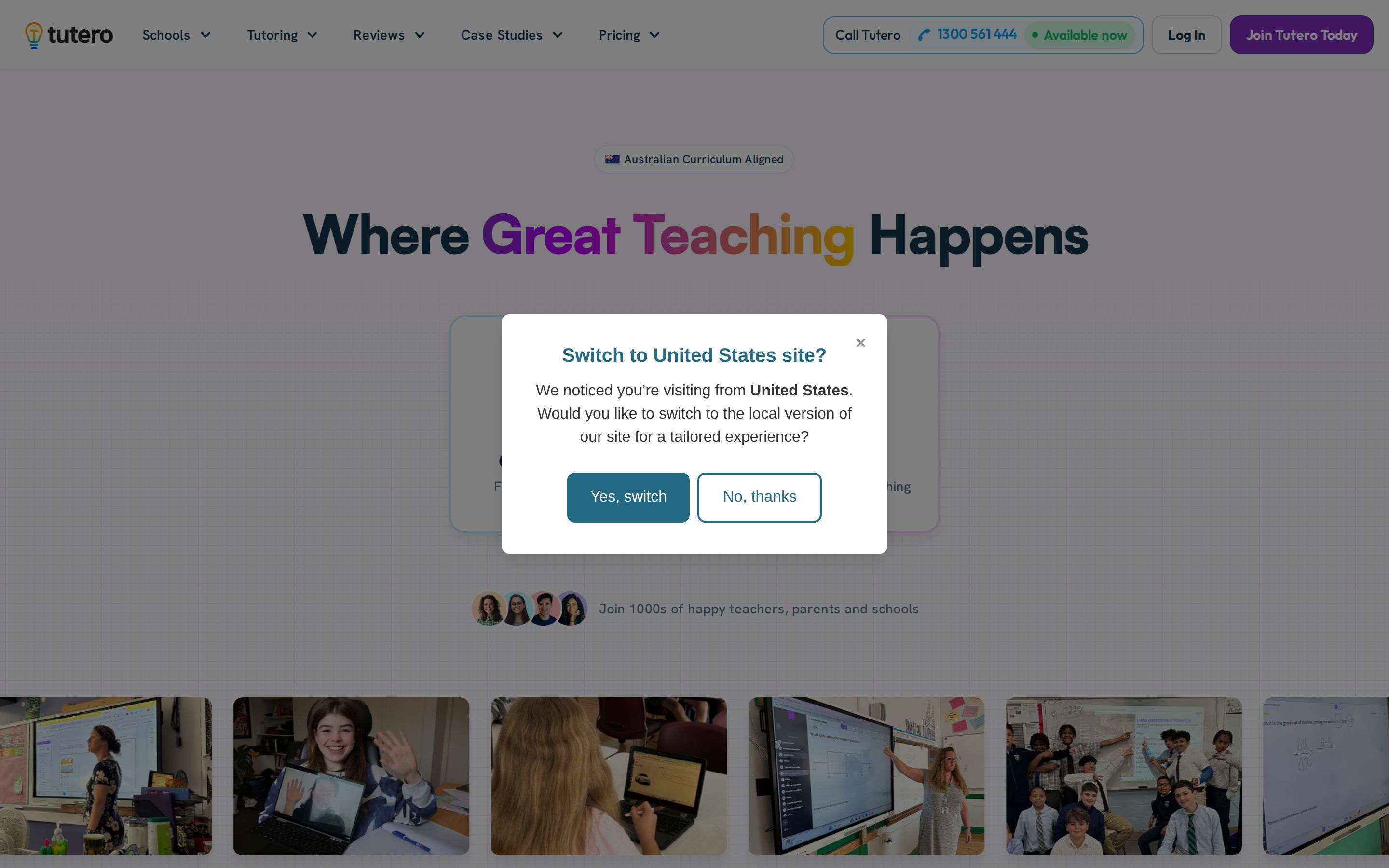
Tutero's homepage solves an audience-splitting problem in the first screen: two large cards send parents to online tutoring and schools to the AI platform before any scrolling happens.
The tone is deliberately warm — multicolour headline type, rounded cards, classroom photography — but the underlying structure is a disciplined, localisation-aware Webflow site.
About the client
Tutero provides online tutoring for students and families alongside Tutero AI, a teaching platform aimed at schools.
The site signals a US market focus with a "U.S. Standards Aligned" badge and a /us/ route segment, while school crests provide institutional proof.
- Industry
- Education
- Profile
- Education technology, schools and families
- Country
- Australia / United States
Website goals
- Separate two very different buyers — parents and school decision-makers — without building two websites.
- Communicate trust in a category where safeguarding and credibility matter more than features.
- Localise for the US market while keeping one content system.
- Support high-volume SEO content across tutoring subjects, reviews and case studies.
Discovery findings
Two funnels, one brand
Parent and school journeys diverge in the first interaction and never merge again until the footer, which keeps messaging honest to each buyer.
Warmth as risk reduction
Rounded shapes, soft palette and human imagery counter the coldness most edtech inherits from its dashboards.
Curriculum as content
Subject and year-level structure is modelled as browsable content, which serves both parents searching for a topic and search engines indexing long-tail demand.
Progressive proof
Evidence is placed where the doubt appears — pricing near reassurance, outcomes near school procurement — rather than pooled in one testimonial band.
Design approach
- A gradient-mapped headline where each word carries a different hue — playful, but restricted to one element per page.
- Soft grid paper background that references school workbooks without becoming literal.
- Rounded cards with tinted borders that colour-code the two audience paths.
- Real classroom and session photography rather than illustration, which carries the trust argument.
Design decisions
Radius as tone
A consistently generous corner radius does more for approachability than any illustration, and it costs nothing in performance.
Colour with a job
Soft brand colour blocks separate audience zones, so a visitor always knows which conversation they are in.
Human imagery, edited hard
Photography is used sparingly and always of real learning contexts, which keeps warmth from tipping into stock-photo generic.
Typographic calm
A single humanist family across both funnels holds the brand together while colour and imagery do the differentiation.
UI/UX highlights
Audience fork above the fold
Two equally weighted cards, each with an icon, label and audience line, replace a generic hero CTA.
Contact affordance in the header
A phone number with a live "Available now" indicator sits beside the primary sign-up button.
Photographic proof rail
A horizontally scrolling strip of real sessions runs directly under the fork.
Multi-level navigation
Schools, Tutoring, Reviews, Case Studies and Pricing each open grouped dropdowns.
Information architecture
- Localisation
- A /us/ path segment scopes market-specific pages such as /us/online-tutoring.
- Products
- Tutoring for families and Tutero AI for schools, split at the top level and again in the nav.
- Proof
- Dedicated Reviews and Case Studies sections surfaced in the primary navigation.
- Commercial
- Pricing carries its own menu group rather than being buried in a footer.
CMS strategy
Case studies and reviews are structured content, exposed as navigation groups rather than one-off pages.
Subject and location tutoring pages follow a repeatable template, which is what makes a large SEO footprint maintainable in Webflow.
Imagery is delivered in AVIF from the CMS, so editors upload once and the platform serves the modern format.
Design showcase
Development highlights
Collection-driven curriculum
Subjects and year levels are CMS records, so hundreds of long-tail pages exist without hundreds of hand-built layouts.
Audience-scoped components
Shared blocks accept audience variants, avoiding a duplicated component set for parents and schools.
Form architecture
Distinct forms per funnel route to different downstream owners, which is the difference between a lead and a lost enquiry.
Responsive typography scale
Fluid type steps keep headline measure readable from 390px to widescreen without manual overrides.
Key features
Dual-path hero
Product selection happens before scroll, which removes the usual education-site confusion.
Live availability indicator
A status dot next to the phone number implies a staffed, responsive service.
School crest wall
Institutional logos used as trust proof for the schools audience.
Standards badge
A small flag-and-label component establishing curriculum alignment immediately.
Technical highlights
- Webflow front end served through Cloudflare, with assets on the Webflow CDN.
- AVIF-first image pipeline across hero, rail and proof sections.
- Path-based localisation (/us/) rather than subdomains, keeping authority on one domain.
- A separate product surface at tutero.ai linked from the marketing site.
Performance & accessibility
- Photography is served as AVIF with PNG fallbacks, a meaningful saving on an image-heavy page.
- The proof rail uses horizontal scroll rather than a script-driven slider, so it degrades gracefully.
- Audience cards are large, high-contrast tap targets that comfortably exceed minimum touch sizing.
- Badge text and headline colour are set on light backgrounds with sufficient contrast for AA body copy.
Responsive experience
- The two audience cards stack vertically on mobile while keeping identical visual weight.
- The photo rail remains a swipeable horizontal strip on touch devices — a natural mobile gesture rather than a compromise.
- The multi-word gradient headline rewraps cleanly at small sizes without breaking its colour rhythm.
Challenges solved
Two buyers with opposite motivations
Solved with a first-screen fork instead of a compromise hero that speaks to neither.
Warmth without losing institutional credibility
Solved by pairing playful type with real classroom photography and school crests.
Scaling SEO content in a CMS
Solved with templated subject and market pages behind structured collections.
Technologies used
- Webflow
- Webflow CMS
- Cloudflare
- AVIF media pipeline
Identified from public markup, asset origins and response headers only.
How Muonix would build this
A delivery plan for a site at this standard, scoped the way we actually run engagements — three senior founders, no handoffs, fixed phases.
- 01
Audience mapping and routing
Week 1–2Separate the two funnels on paper first: objections, vocabulary, proof, and the moment each audience needs a price.
- Dual journey maps
- Objection-to-proof matrix
- Sitemap with routing logic
- Tone guide per audience
- 02
Warm design system
Week 3–5Build a friendly but disciplined system — soft radii, generous spacing, illustration rules — that can carry both a parent page and a procurement page.
- Token set and radius scale
- Illustration and photo direction
- Component library
- Accessibility contrast pass
- 03
Webflow build and curriculum CMS
Week 6–10Model subjects, year levels and resources as collections so the catalogue grows without new page builds.
- Curriculum collection schema
- Template pages per content type
- Search and filter UI
- Editor documentation
- 04
Conversion, QA and launch
Week 11–12Instrument both funnels separately, test forms on real devices, and ship with per-audience analytics goals.
- Split funnel analytics
- Form and CRM wiring
- Cross-device QA
- Launch and redirect plan
Observable impact
- Audience clarity
- Neither buyer has to read past content aimed at the other to reach their own proof.
- Search surface
- A CMS-modelled curriculum creates a large, legitimately useful long-tail footprint.
- Trust signalling
- Warmth and specificity together lower perceived risk for a high-consideration family decision.
- Editorial independence
- Content teams extend the catalogue without engineering involvement.
Verdict & takeaways
“A masterclass in serving two buyers from one brand without diluting either.”
- 01When you have two audiences, route early — do not average the message.
- 02Warmth is a conversion tool in categories where the buyer is protecting someone.
- 03Model your catalogue as content and the long tail builds itself.
Related services
Want this standard of build for your product?
Three senior founders, no outsourcing, one accountable team across Webflow, Shopify, WordPress and modern JavaScript. Tell us what the site has to do and we'll scope it honestly.