Aibidia
Enterprise restraint for a transfer pricing platform
A quiet, serif-led SaaS site that sells a complex tax platform to Fortune-scale finance teams without a single hard-sell gesture.
- Industry
- SaaS
- Platform
- Webflow
- Reviewed
- 2026
- Region
- Finland
- Study type
- Independent teardown
- Surfaces reviewed
- Home, platform, resources, demo
- Viewports captured
- 1440 · 834 · 390
- Stack confirmed via
- Markup, assets, headers
- Comparable build
- 8–11 weeks
- Team shape
- Design + Webflow + SEO
Independent design and engineering study of a publicly available website. Observations are drawn from the live site, its markup and its response headers. Muonix Technolabs is not affiliated with, and does not claim authorship of, the work reviewed here.
The brief
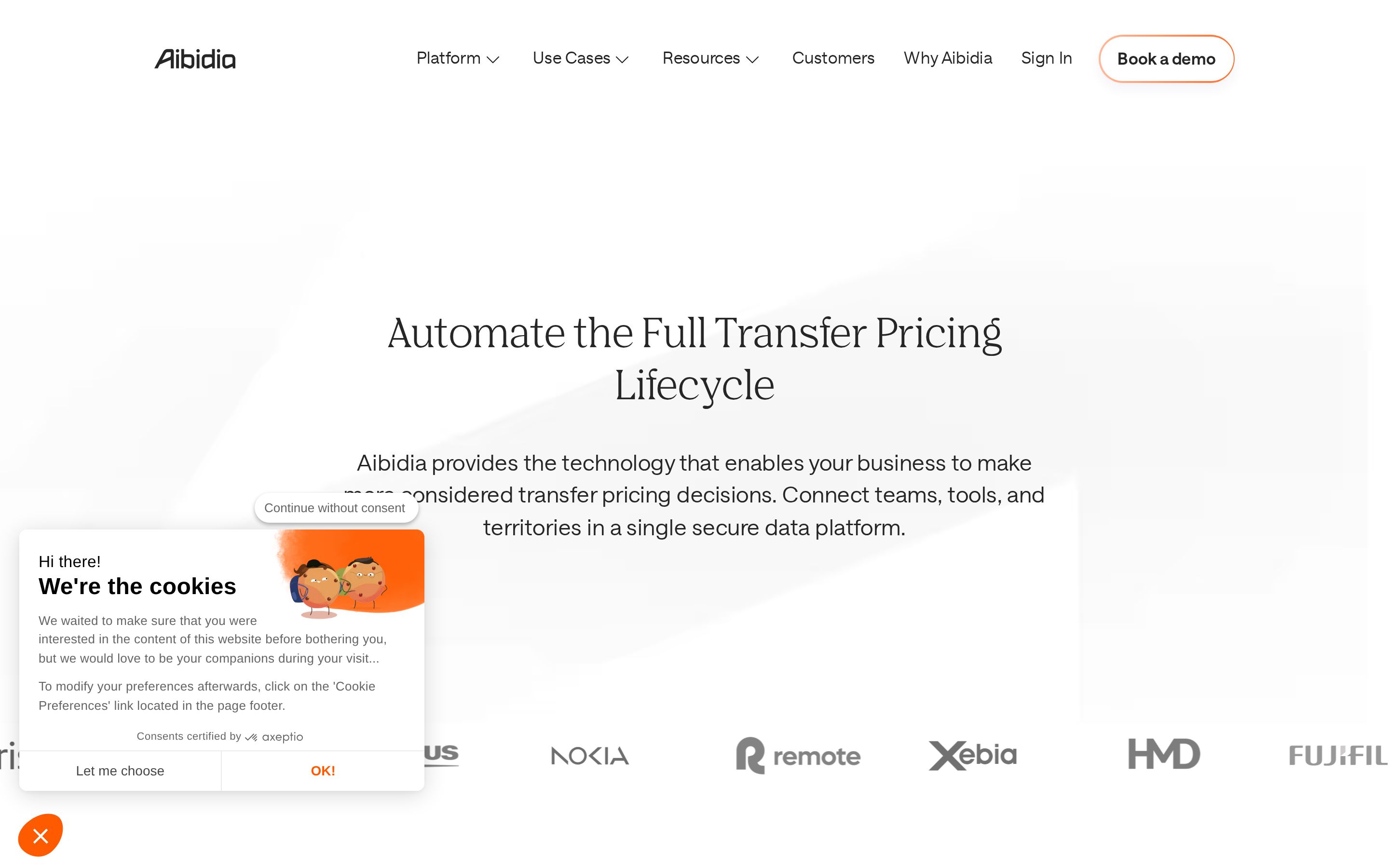
Transfer pricing is one of the least glamorous corners of enterprise finance, and it is bought by people who are professionally allergic to hype. Aibidia's site understands that. It opens with a serif headline, a short claim and a single outlined button, and it never raises its voice again.
That restraint is a deliberate commercial choice. The audience is a tax director inside a multinational group who is assembling an internal business case. Their job on the site is not to be excited; it is to gather enough evidence to defend a shortlist. Every layout decision serves that: named customers early, modules explained in plain language, one route to a conversation.
Underneath, the build is unfussy Webflow. Structure carries the weight — CMS-driven case studies, grouped mega-menus, one canonical demo page — rather than script or motion. It is the kind of site that ages well because there is very little in it that can date.
We reviewed the public site across three viewports and traced its content model, asset strategy and conversion architecture. What follows is what the implementation shows, and how we would build to the same standard.
Project overview
Aibidia's marketing site carries a genuinely complex product — transfer pricing compliance, operational TP and an AI research assistant — into a layout that reads like a considered enterprise brochure rather than a feature list.
The build runs on Webflow and leans on generous whitespace, a high-contrast serif display face and a single warm accent to signal seniority to tax directors and CFOs.
About the client
Aibidia is a Helsinki-founded software company providing a transfer pricing platform used by large multinational groups.
The homepage names customers including Nokia, Fujifilm, Olympus, Valeo, Symrise and Remote, which sets the buying committee squarely at enterprise finance and tax leadership.
- Industry
- SaaS
- Profile
- Enterprise SaaS, global tax teams
- Country
- Finland
Website goals
- Establish credibility with enterprise tax and finance buyers inside the first viewport.
- Explain a multi-module platform — Compliance, Operational TP and TP Aurora — without overwhelming a non-technical reader.
- Route every path toward one primary action: booking a call with an Aibidia expert.
- Support an ongoing publishing programme of customer stories and resources.
Discovery findings
Buying committee, not a buyer
Named enterprise logos appear above the fold and quotes carry role and company. The page is written to be forwarded internally, which is the real conversion event in enterprise finance.
Complexity deferred, never dumbed down
Three modules are summarised in a sentence each on the homepage, with the mechanics pushed to dedicated pages. Nothing is hidden; it is sequenced.
One conversion terminal
Every CTA in the navigation, the module cards and the closing block resolves to the same demo page, so intent is never split across competing forms.
Proof designed to scale
Case studies live in a CMS collection with a stable URL pattern, so the marketing team publishes evidence without design involvement.
Design approach
- Editorial serif headlines against a near-white canvas, with body copy set at a comfortable reading measure.
- One accent colour, used almost exclusively on the primary demo button, so the call to action is never in competition with the page.
- Soft, low-contrast background geometry instead of imagery, which keeps focus on the words.
- Logo walls rendered in grey with colour on hover — a restrained way to use customer names as proof.
Design decisions
Serif as a credibility signal
A high-contrast serif display face moves the register from startup to institution before a word is read — cheaper and more durable than photography.
Accent scarcity
One warm accent, reserved almost entirely for the demo button, means the eye always knows where the next step is.
Geometry instead of imagery
Low-contrast CSS shapes replace stock art, keeping the largest contentful element as text and the tone unsentimental.
Greyscale proof
Logos render grey and colour on hover, so customer names read as evidence rather than decoration.
UI/UX highlights
Single dominant CTA
"Book a demo" is the only outlined element in the navigation, repeated at the foot of each major block.
Progressive disclosure
Platform modules are summarised in three cards, each linking to its own deep page rather than expanding inline.
Quote carousel
Customer quotes are paginated rather than stacked, keeping the page short while still surfacing four named references.
Mega-menu navigation
Platform, Use Cases and Resources open grouped menus, so a large site stays two clicks deep.
Information architecture
- Platform
- Module pages under /platform for compliance, operational TP and the AI assistant.
- Proof
- A dedicated /case-studies collection, each entry linked from the homepage quote carousel.
- Positioning
- A standalone /why-aibidia page carrying the differentiation argument.
- Conversion
- /book-a-demo as the single terminal page for every CTA on the site.
CMS strategy
Case studies are served from a Webflow CMS collection with a consistent URL pattern, so the marketing team can publish a customer story without touching page structure.
Homepage testimonials reference those same CMS entries, which keeps the quote, the portrait and the story link in one editable record.
Resource and use-case sections follow the same collection-driven pattern, giving editors a template per content type.
Design showcase
Development highlights
Symbol-driven page assembly
Repeated conversion and module blocks are single components, so a copy change propagates site-wide instead of drifting per page.
SVG-first asset budget
Logos, icons and background geometry ship as vectors, which keeps the hero light and crisp at any density.
Native interaction states
Hover, carousel and menu behaviour is handled by platform interactions rather than bespoke script, reducing runtime cost and maintenance surface.
Indexable content model
Every CMS template emits its own title, description and canonical, so published proof is discoverable rather than trapped behind a carousel.
Key features
Animated customer marquee
A continuous logo rail with greyscale-to-colour states, used as social proof above the fold.
Module cards
Three platform entry points with counters, blurbs and direct links into deeper product pages.
Reference carousel
Named quotes with role, company and a link to the full CMS-published story.
Persistent demo CTA
An outlined navigation button plus repeated in-page conversion blocks.
Technical highlights
- Webflow-hosted front end served from the Webflow CDN, with assets on the website-files.com origin.
- SVG-first asset strategy for logos, icons and background geometry.
- CMS collections driving case studies and resources with predictable, indexable URLs.
- Interaction states handled in Webflow rather than bespoke script, keeping the runtime light.
Performance & accessibility
- Vector logos and interface artwork are delivered as SVG, so the hero and logo wall stay crisp without heavy raster payloads.
- Hero decoration is CSS-driven rather than image-driven, which keeps the largest contentful element as text.
- Text sits on near-white with near-black type, comfortably clearing AA contrast for body content.
- Customer logos carry alt text, and each platform card is a real link rather than a scripted click target.
Responsive experience
- The three-column platform grid collapses to a single stack, retaining the same card order on mobile.
- The logo marquee continues to scroll horizontally on small screens instead of wrapping into a ragged block.
- Serif display sizes step down noticeably on mobile, protecting line length on a 390px viewport.
Challenges solved
Explaining a technical product to a finance audience
Solved by leading with outcomes and deferring mechanics to module pages, so the homepage never becomes a specification.
Using enterprise logos without noise
Solved with a greyscale rail and hover colour, which reads as proof rather than decoration.
Keeping a large site shallow
Solved with grouped mega-menus and one canonical conversion page.
Technologies used
- Webflow
- Webflow CMS
- SVG / CSS animation
- Cloudflare
Identified from public markup, asset origins and response headers only.
How Muonix would build this
A delivery plan for a site at this standard, scoped the way we actually run engagements — three senior founders, no handoffs, fixed phases.
- 01
Positioning and message architecture
Week 1–2Interview sales and product, map the buying committee, and write the homepage narrative before a single frame is drawn.
- Audience and objection map
- Message hierarchy
- Sitemap and URL plan
- Content inventory
- 02
Editorial design system
Week 3–5Build a typographic system first — display serif, working sans, one accent — then compose pages from a small set of proven blocks.
- Type and colour tokens
- Component library in Figma
- Home, platform and resource layouts
- Responsive specs at three breakpoints
- 03
Webflow build and CMS modelling
Week 6–9Model collections for case studies, resources and use cases, then build every page from reusable symbols so editors cannot break layout.
- Collection schemas
- Symbol-based page build
- Editor guardrails and help text
- SEO fields per template
- 04
Performance, accessibility and launch
Week 10–11Compress the asset budget, verify contrast and focus order, wire analytics and demo routing, then ship behind a redirect map.
- Core Web Vitals pass
- WCAG AA audit
- Redirect map
- Analytics and CRM handoff
Observable impact
- Clarity of next step
- A single terminal conversion page means no dead ends and no competing forms anywhere in the funnel.
- Publishing velocity
- New customer stories land in an existing template, so evidence compounds without design debt.
- Reading comfort
- Near-black type on near-white at a controlled measure clears AA comfortably for body content.
- Durability
- Nothing in the visual system depends on a trend, so the site can run for years without a redesign.
Verdict & takeaways
“The most disciplined enterprise SaaS site in this collection — it wins by removing, not adding.”
- 01In enterprise sales, restraint reads as seniority; volume reads as risk.
- 02Model proof as content, not as design, and it will keep scaling after launch.
- 03One accent colour and one conversion page will out-convert five of each.
Related services
Want this standard of build for your product?
Three senior founders, no outsourcing, one accountable team across Webflow, Shopify, WordPress and modern JavaScript. Tell us what the site has to do and we'll scope it honestly.